The Home Depot
Samsung BeSpoke Project
Worked with Samsung to enhance their BeSpoke Smart Customizable Refrigerator user experience shopping at homedepot.com.
Demographics
– Age group 23 to 65 in the US
– Interested in Smart Appliances
– Earning an average to high salary (65,000+ per annum)
– Shops on homedepot.com
– Loves configurable/customizable products
User Journey Map
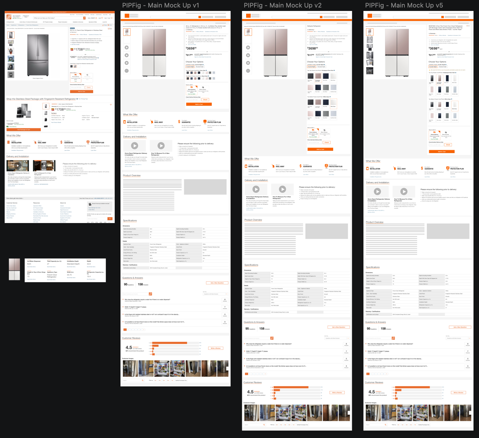
Lo-Fi & Hi-Fi Mocks


User Research on the PIP
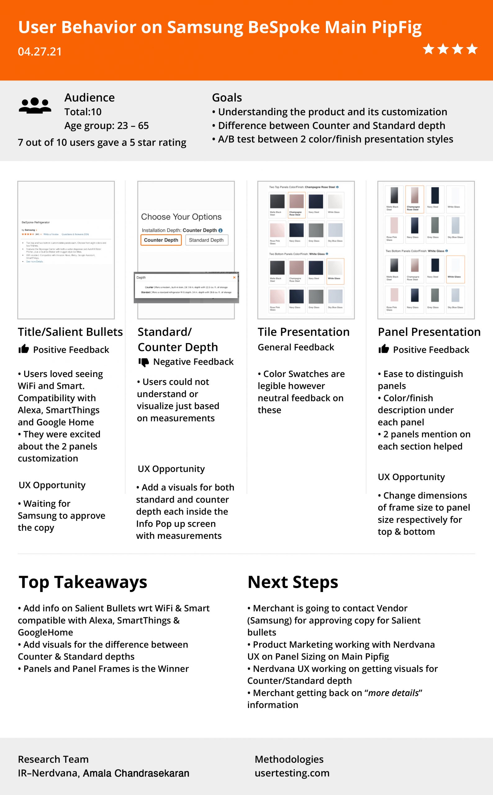
Salient Bullets
Challenges:
1. Users did not know this is a Smart and WiFi enabled refrigerator compatible with SmartThings, Alexa and Google Home as Samsung had originally planned on marketing it as solely a customizable refrigerator
Solution!
On recommendation, and also data from the user test, Samsung was happy to add “Smart and Customizable keywords” on the Product Title and they wanted to push WiFi enabled and compatibility with Smart devices on the Product Specs below, linking it in the Salient Bullets.
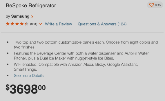
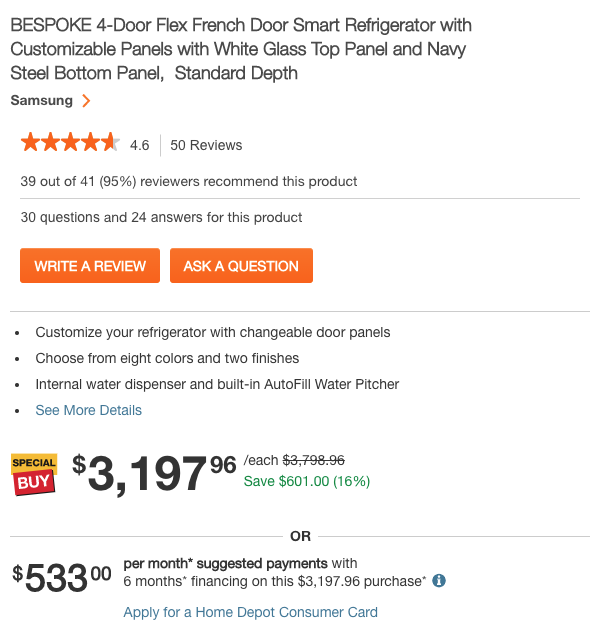
Created assets for Counter and Standard Depth, simplifying it for the user

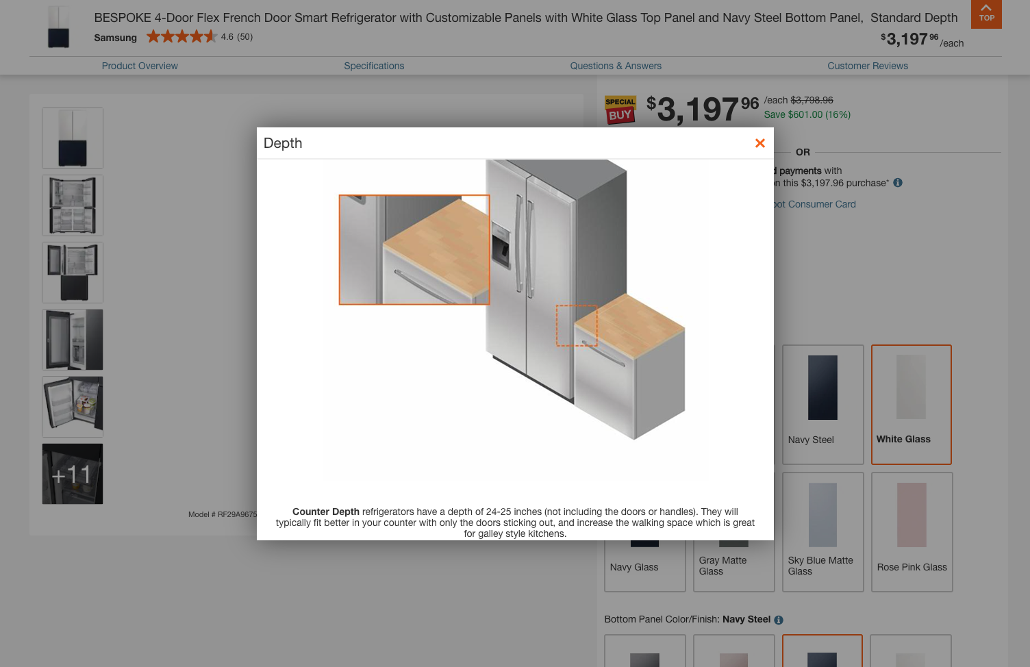
Evolution of Panel Presentation on THD for Samsung Bespoke French Door Refrigerator
1st concept
Challenges:
1. Too small for the user to understand finish of the panels
2. Having to add the info icon for every finish adds complexity and unnecessarily too many touch-points before the user can add to cart
3. Having color options laid in this style increases the scroll length for the experience that could be improved
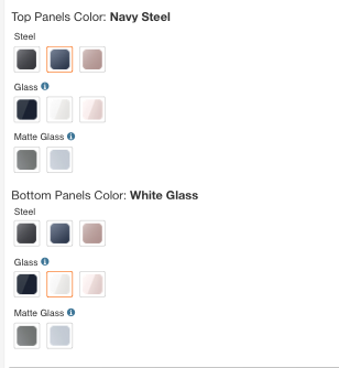
2nd concept

Challenges:
1. Separating colors and finishes was the thought process by disabling finishes that were not available for certain colors but Samsung’s vision was to introduce more colors in the future with unique finishes, which meant that we needed more dev hours to implement this
2. Samsung also wanted to introduce custom panels which meant that we needed to add another layer of customization under finishes, again lengthening the process
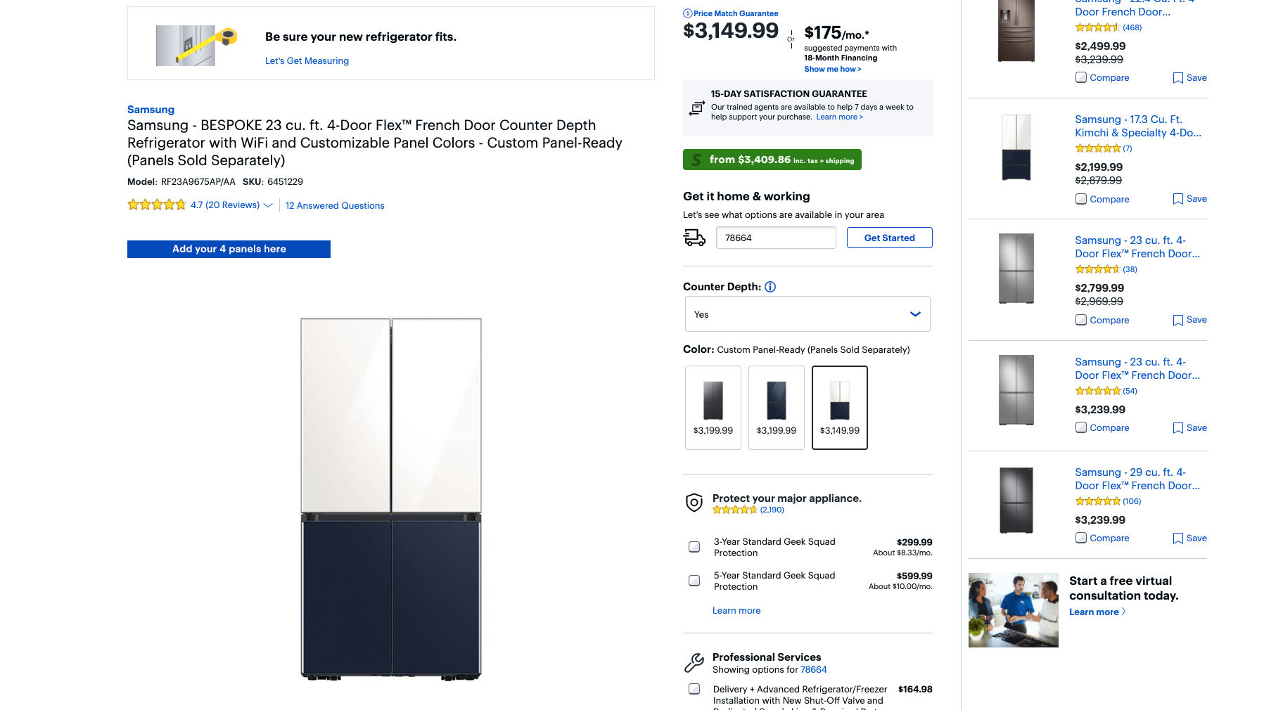
3rd concept
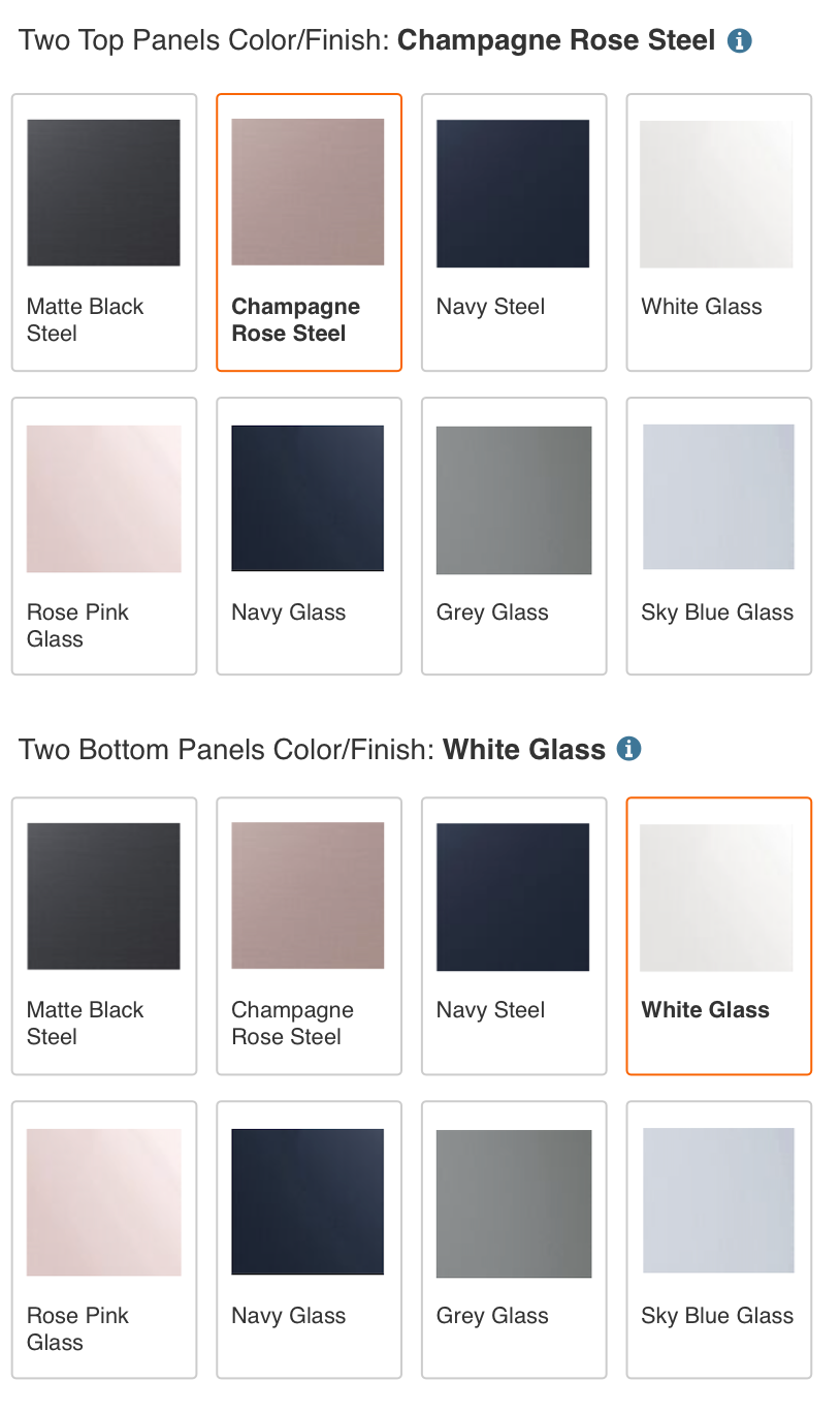
Challenges:
1. This approach was better than the other two as the user got to directly see finishes and if needed more education could click on the info icon that explained the colors and finishes however when usertesting, we found that users seldom read the “Two top panels” and “Two bottom panels” as category choices
Solution
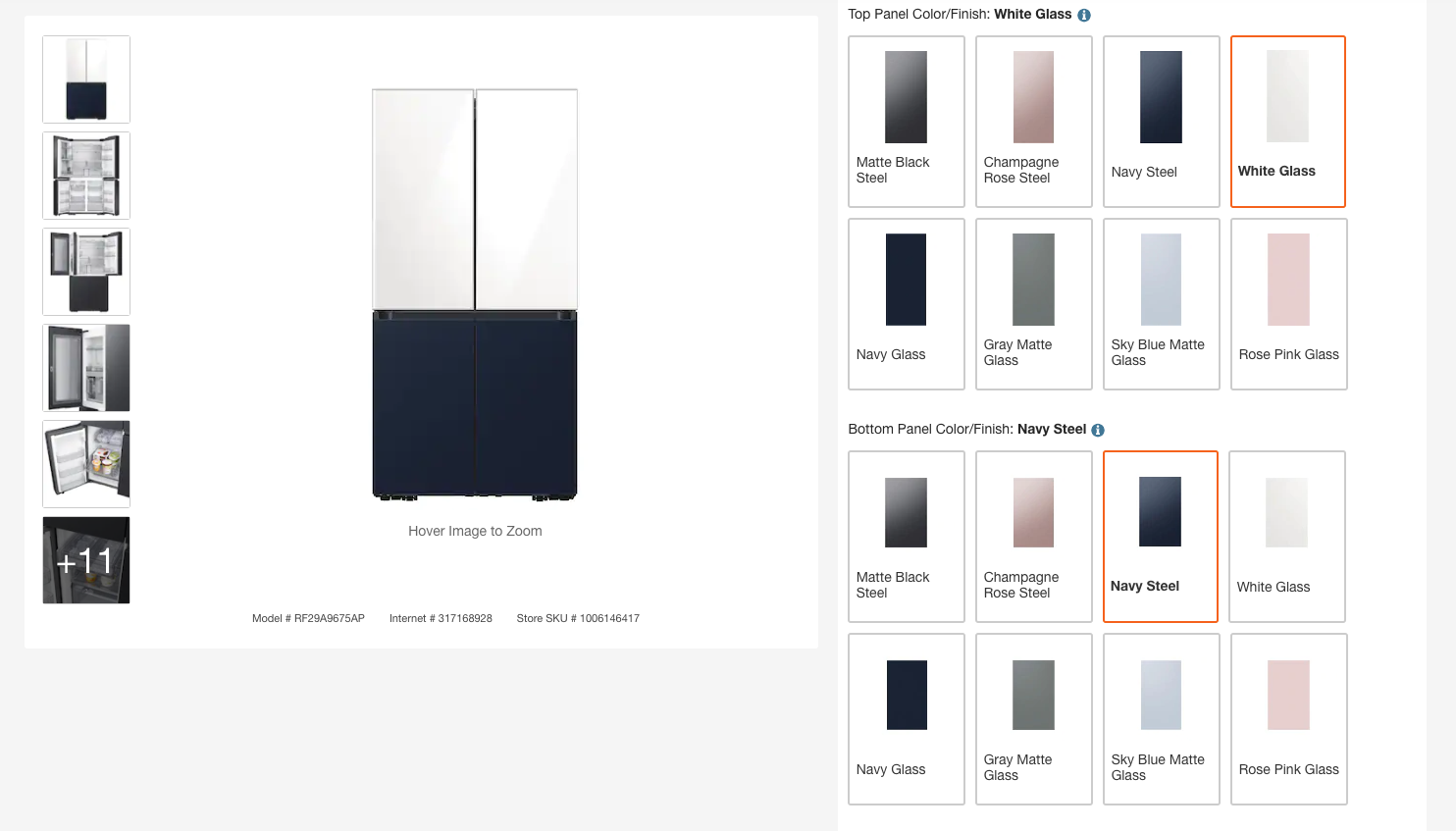
Adding the finishes and colors in corresponding top and bottom panel sizes on the category presentation, made the experience more user-centric and appealing to users as it was the best SIMPLE and EFFICIENT fix!
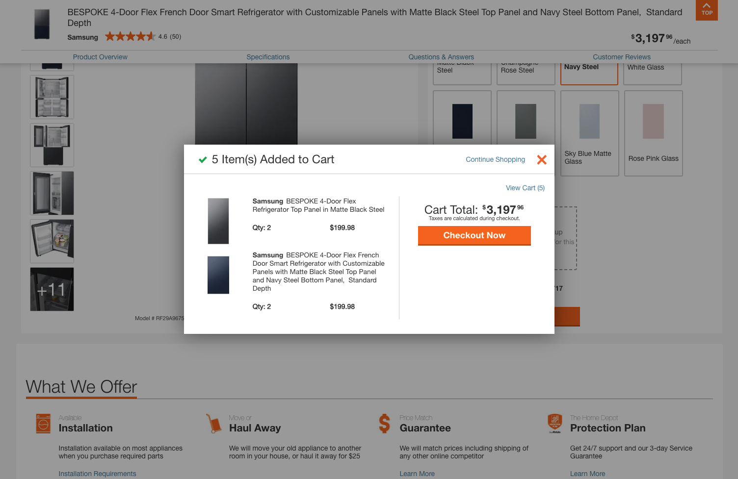
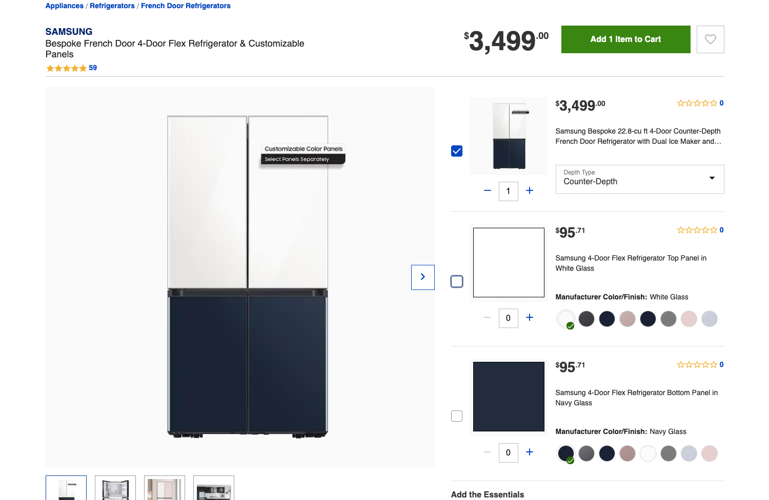
Challenges with panel Quantity:
Making the customer aware that the top 2 panels and bottom 2 panels can only be configured and not all 4 separately, though that functionality is available when they shop panels separately.
Solution:
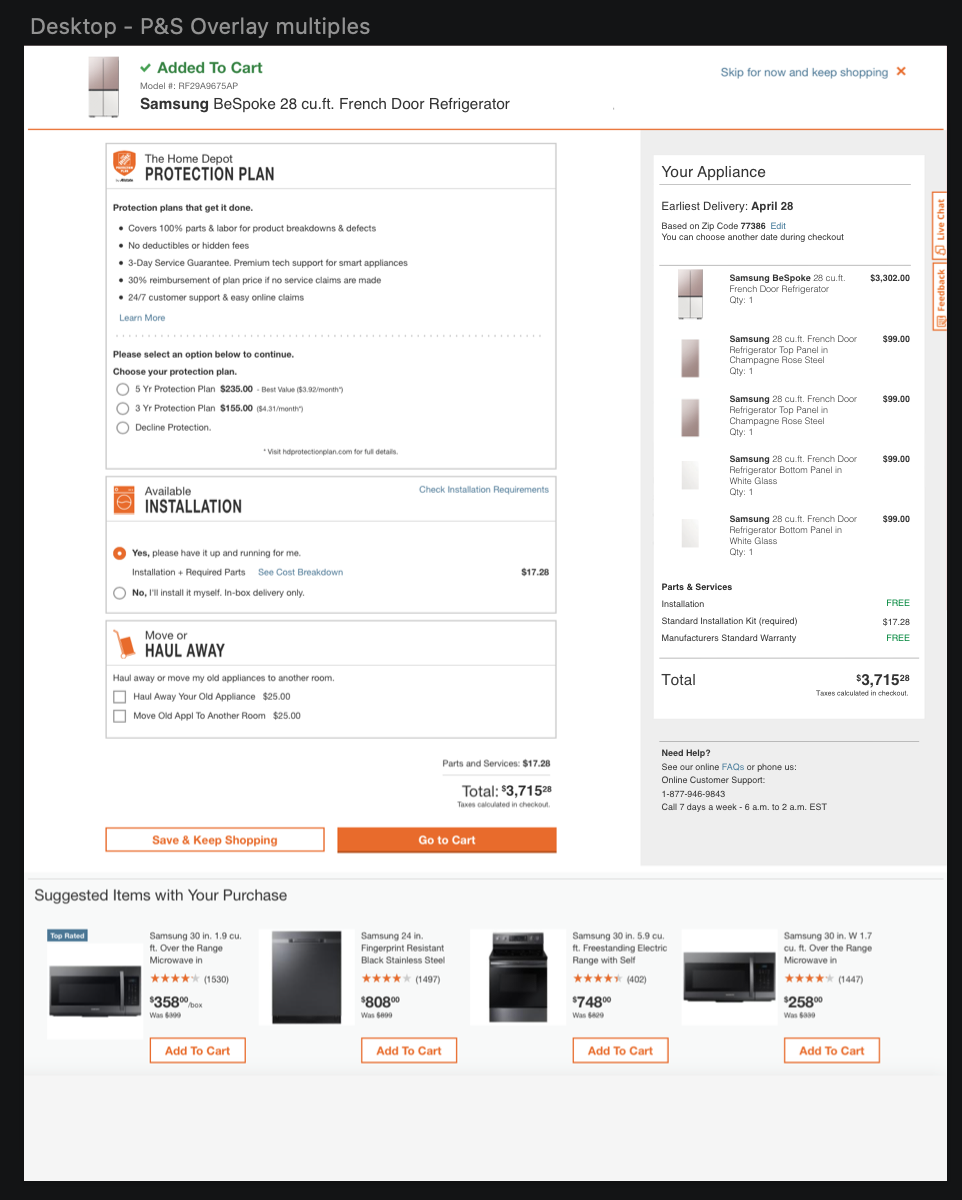
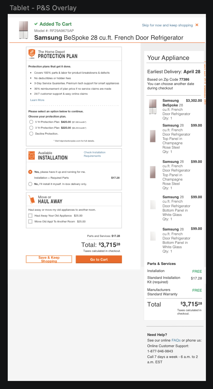
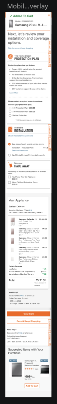
We made sure to distinguish top panels from bottom and let customer make only one selection on Top and one on Bottom. This auto added 2 each while carting, resulting in no confusion as it also reflected the same configuration selections on the Visualizer.
Competitor Analysis – Experiences on other websites:
BEST BUY:
LOWE’S:
Key UX learnings and what THD has that these websites do not:
– Drop down functionality is not the best of experiences on mobile
– Color selection does not reflect on the gallery display picture
– Step by step customization and more information/education for customers
– Price reflections on selecting panels
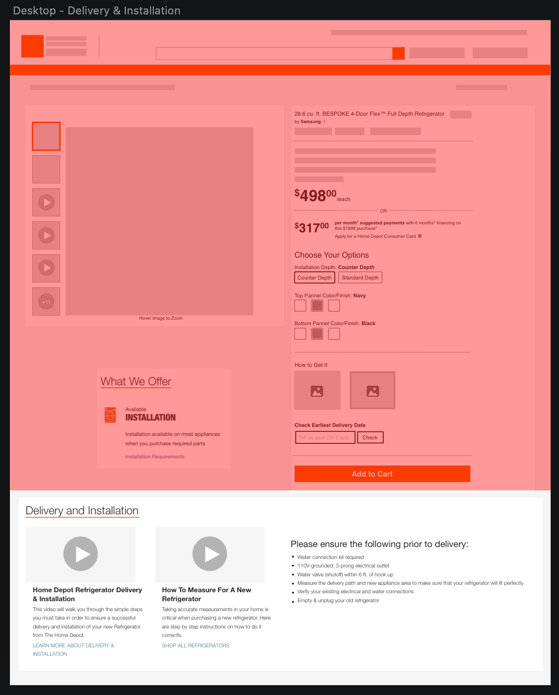
– Information on Delivery Installation with price and availability right on the same PIP (Product Information Page).
Up Funnel Journey
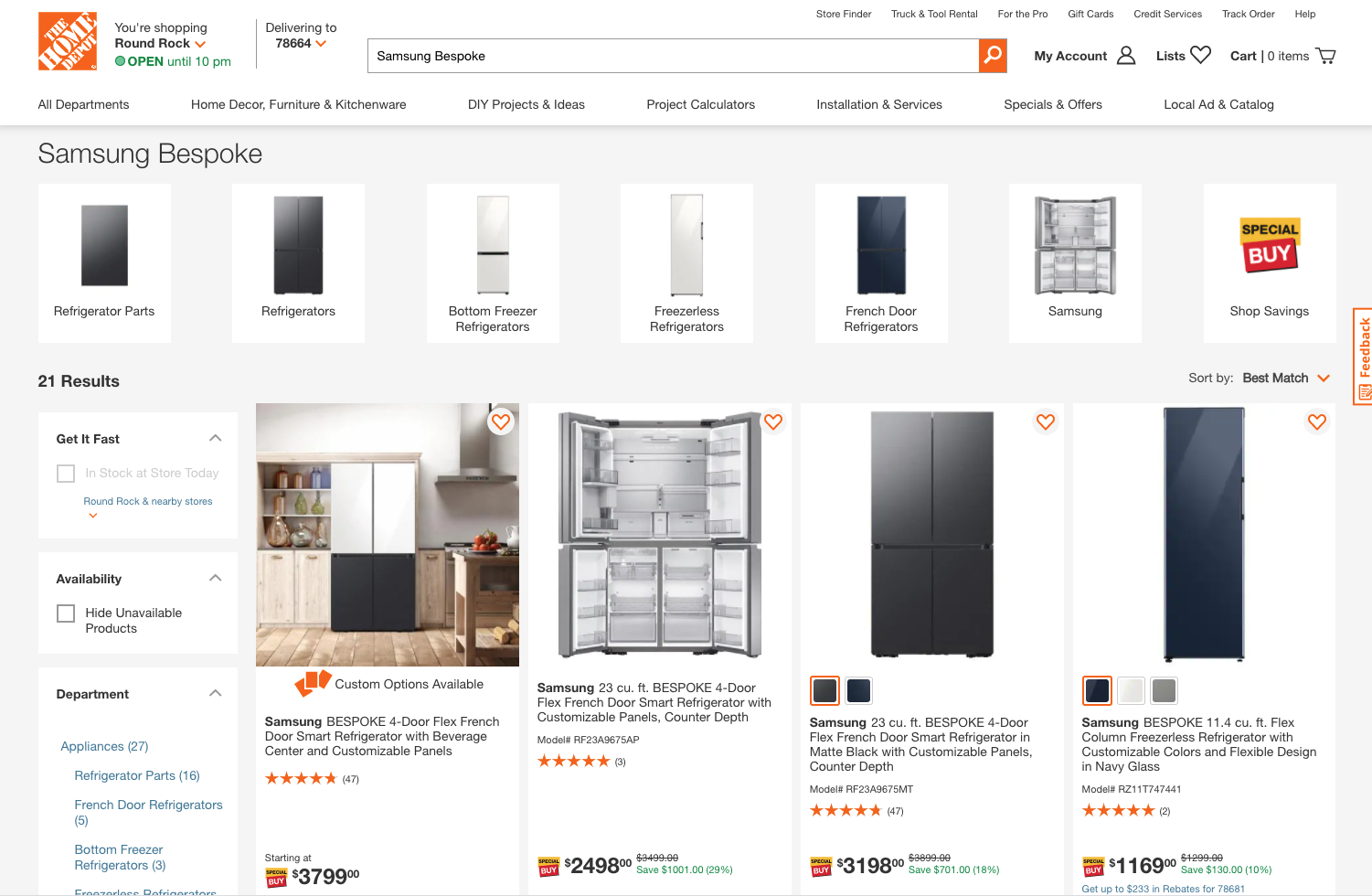
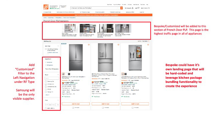
– Making sure the customizable Bespoke Refrigerator SKU shows first when searching on THD.com and Appliances > French Door Refrigerator
– Adding lifestyle images on the PLP, to make users curious and increase conversion from the pod to the PIP
Few other Up Funnel Additions
– Adding “customized” filter to the left nav
– Adding Bespoke/Customized on the French Door PLP (which gets the most traffic)
– Bespoke could have it’s own landing page that will have to be hardcoded and leverage kitchen package bundling functionality
Post Launch User Test

Kitchen Estimator User Research

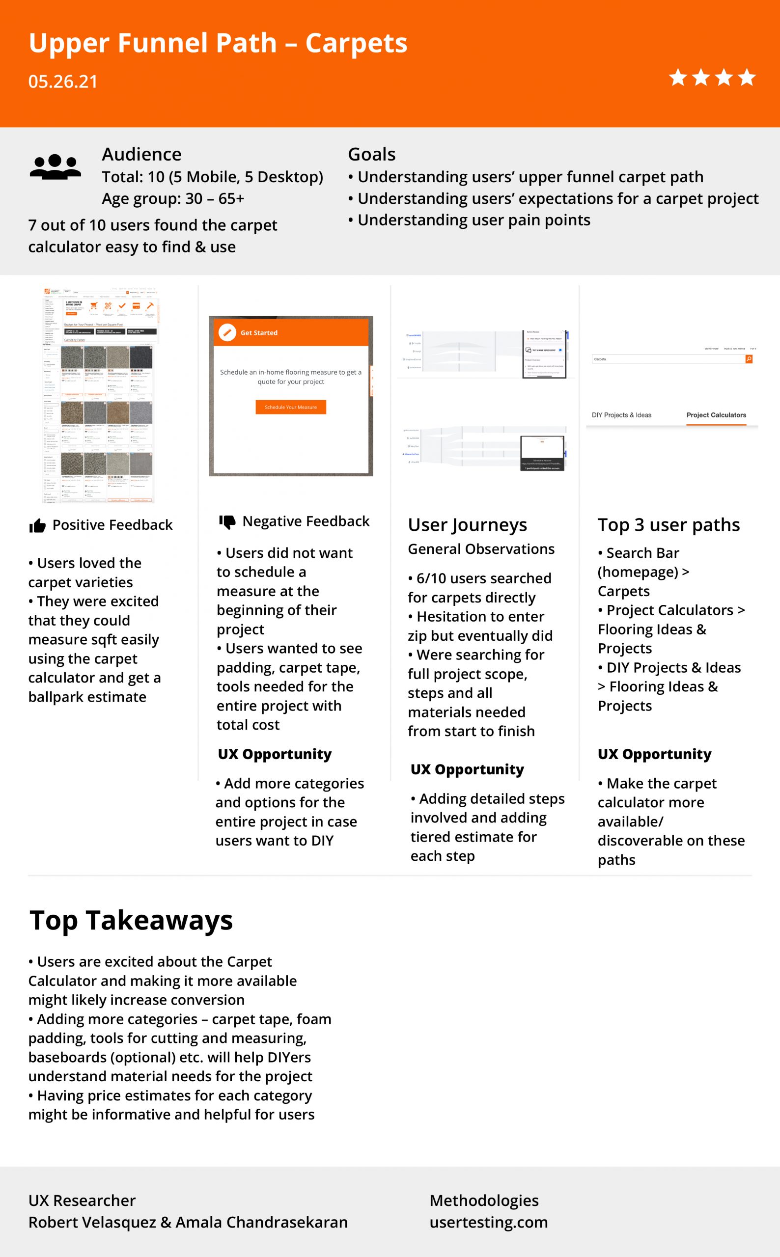
Carpets User Research