PayForward
Modern technology has taken money management apps to a whole new level. Ease, speed, enjoyment, and convenience are rewriting the history of the user experience in banking. While many banks still struggle to digitize their products, new Neobanks have rapidly emerged, changing the rules of the game. One of the biggest challenges is how to create and develop a fintech ecosystem that could organically deliver dozens of products with the possibility to scale up into the bank-as-a-platform in the future.
What is a super app?
The definition of a super app first appeared in Mike Lazaridis’ statement in 2010. A super app is an app that delivers a compelling user experience by leveraging the unique capabilities of the platform.
A super app is the kind of app that people love and use every day because it offers such a seamless, integrated, contextualized and efficient experience.
Unlike mono applications that offer one function in the most convenient and understandable format, the super app advantage is in building an ecosystem capable of providing a solution for different consumer needs. Such a platform collects a large amount of data about users and increases personalization and the speed of customer engagement on this basis.
The most famous example of the super app is WeChat, launched in 2011 by the Chinese internet giant Tencent. WeChat messenger contains more than a million products and micro applications from financial transactions, loans and trade to games, entertainment and ticket booking. Over 800 million active users use the app every month. Other super app examples include Grab, Line and Gojek (Get).
The presence of a large number of products and the flow of big data passing through the bank can become a promising basis for building a highly personalized banking ecosystem around a specific user. And, today, there are more and more advanced technological solutions of data processing and personalization through AI in banking accessible on the market.
However, despite the technological opportunities, the key challenge is delivering the super app experience in a clear and user-friendly way.
Banking super apps are already here
Some financial market players have already begun to take their first steps in the direction of banking super apps. In particular, Revolut is actively scaling its banking ecosystem by adding new features and products, including those provided by third-party institutions.
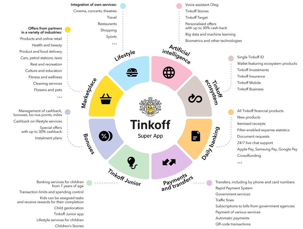
In December 2019, the Russian Tinkoff Bank launched a banking super app that, along with financial products, includes a marketplace of goods and services, a health support system with the ability to choose a doctor and lifestyle services like travel, restaurants and events from third-party providers. The application is personalized and uses machine learning and AI to select products specifically based on the needs of a particular user.
We first introduced our vision of the banking super app in 2016 in the Neobank UX Fintech Case Study. Our team visualized how a mobile banking platform can operate and expand indefinitely through aggregating third-party products via APIs.
Building of the financial super app UX
When we consider how to create a banking super app, there’s an important question to answer: how will it work technically? As this kind of financial digital product is complex, a banking super app could rely on 10 digital banking trends that you probably are already familiar with:
– Blockchain
– Gamification
– Nudge theory
– Robo advising
– Voice processing
– Biometrics
– Social integration
– Personalization via banking AI
– Big data
– Open API and clouds
When it comes to the UX architecture of this banking super app, we have to take into account that the person’s financial life involves not only the user and his money but also his/her family, friends and dozens of financial products that solve different financial needs.
For example, to manage the family budget, the user has to overlook the financial status of his/her family members. Also, the ability to review the financial behaviors of a customer’s friends could provide great insights into how to better manage his/her own finances. Finally, the user would expect for the bank to provide services that would guide them, track the situation and advise on the best ways that the customer can manage his/her financial life.
Considering this, we based our banking super app UX architecture on five key elements:
– User
– Money
– Family
– Friends
– Services
When it comes to the financial UX process in designing this super banking app concept, the main stages we underwent were:
1. Identifying the primary user scenarios
2. Analyzing and determining key app functionality
3. Creating information architecture
4. Exploring trending technologies to provide the most simple and clear solution for the user’s financial journey
5. Creating a delightful design
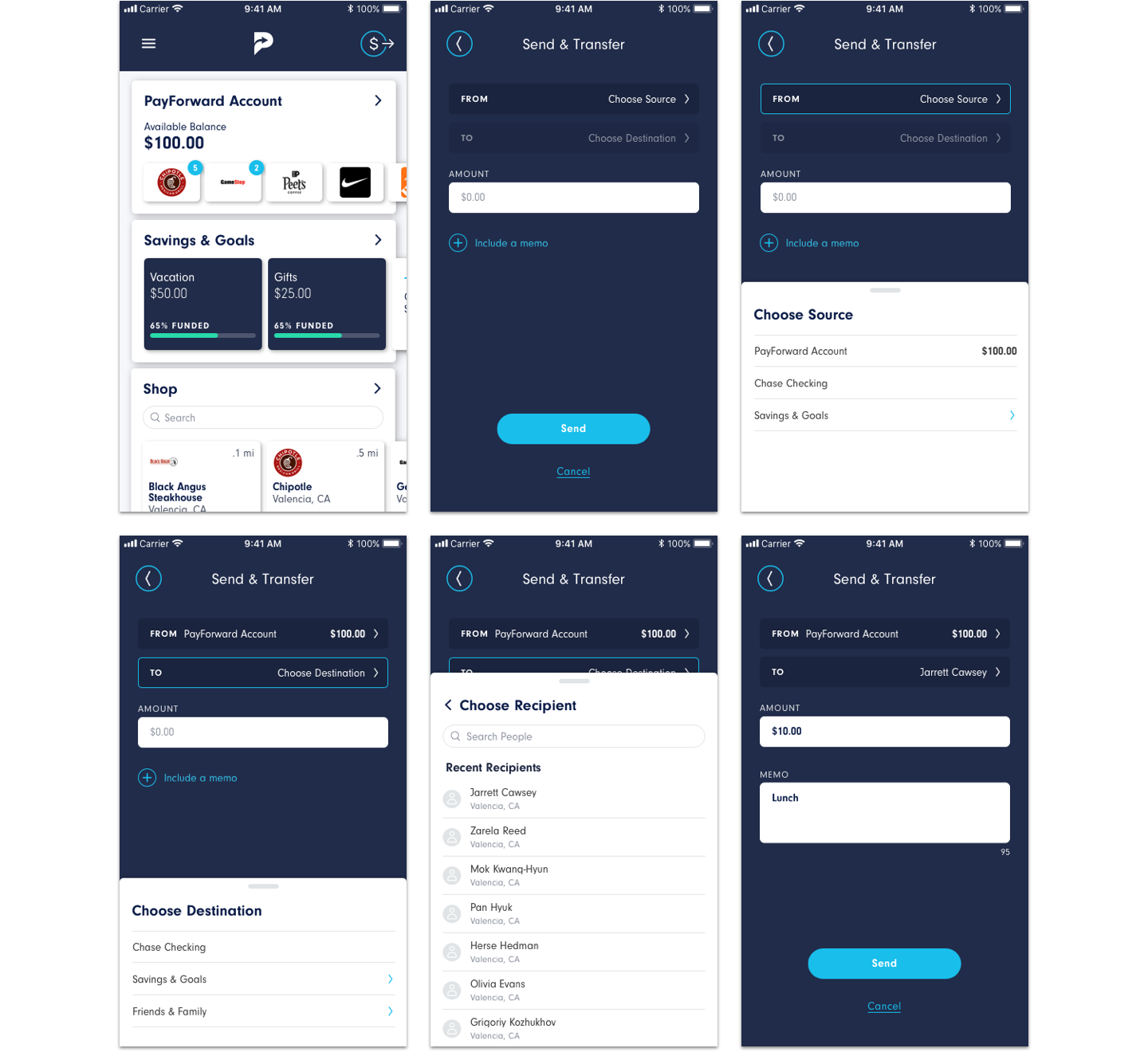
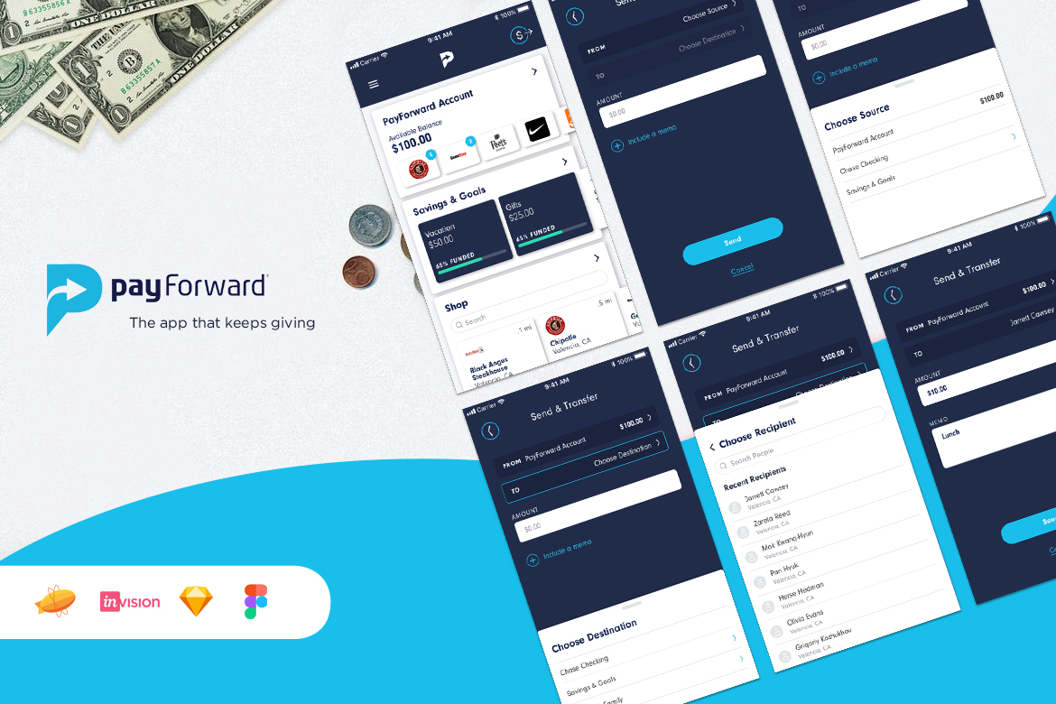
Native iOS, Android App & Website
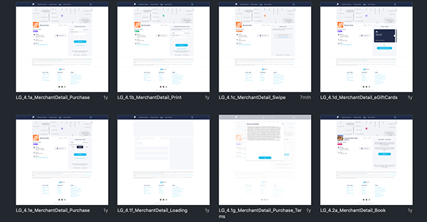
PayForward provides automatic instant cash back on purchases at over 16,000+ Merchants online and in-store. Users can search for stores nearby or in a particular location and get cash back information per store all in one place, they can also search and book hotels and get 5% cash back. Users could use the cash back earned towards future purchases or allocate funds towards medical expenses, charity, holiday decoration or even to plan a vacation.
Users also could opt for a PayForward Visa Debit Card that they can use just like any other Debit Card.
My Role
Research, User Flows, Information Architecture, Wireframes, Lo-Fi and Hi-Fi Mocks, Prototypes, Visual Design & Creating Web/App Animations
Client
www.payforward.com
The Challenge
Although most features work in the mobile web app, the experience would be fuller as a native mobile app. The challenge would be to create an end-to-end mobile experience that embodies and enhances the current experience.
High Level Goals
1. Design an iOS Android app that allows users to easily shop, share, receive, and allocate funds earned.
2. Discover and implement new features
3. Maintain the current logo but explore UI elements
My Process
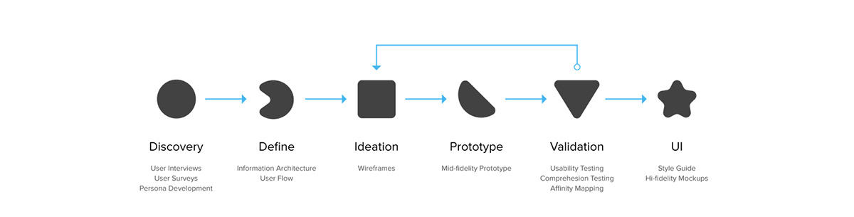
Discovery–User Research
I wanted to learn about how people shop & use the funds earned: On what basis they choose stores, what methods they use to spend their earnings or how they allocate them later in their PayForward wallet. I conducted phone and in-person interviews, and also created a survey that was completed by 25 participants.
The survey was great for quickly gathering information from a sample of my target audience, while the interviews allowed me to gain a deeper understanding of the participant’s behaviors. The main takeaways from the two methods were:
1. People love to see instant rewards or cash back and use cash back apps only when the process is fairly easy. Convenience is KEY.
2. People keep track of savings/cash earned through purchases to use for medical expenses, children’s education and travel plans.
3. People are more likely to use the app in places like grocery stores, gas stations, restaurants, theaters and similar places where most of their day to day expenses are made. Recurring incentives influences user behavior and increases adherence.
Meet Susan
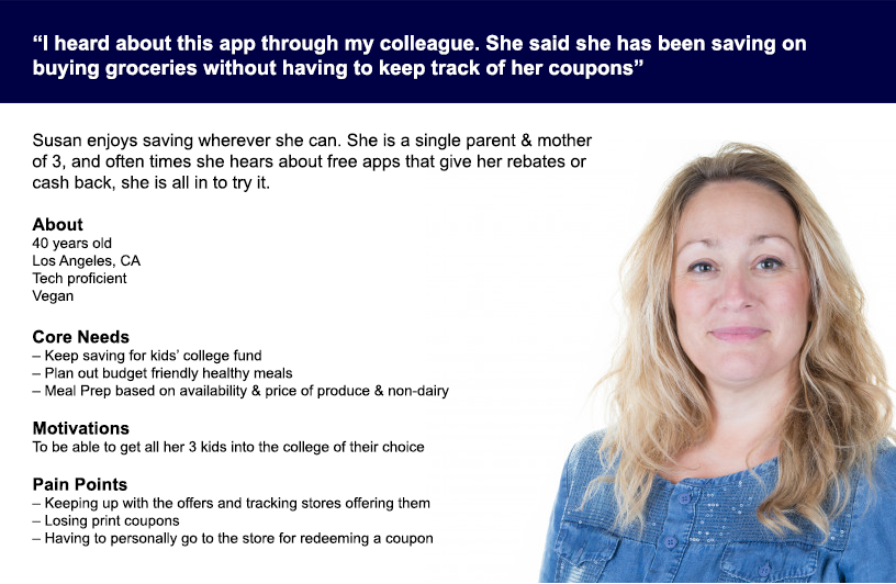
I used the findings to construct a provisional persona, Susan, to help me understand how I can help her/our users achieve their goal using certain features in the app.
Meet Susan Clark, a 40-year old who appreciates offers and tries to get her hands on the best deals for herself and her family, keeps track of discounts & in-store deals so she is prepared before she shops.
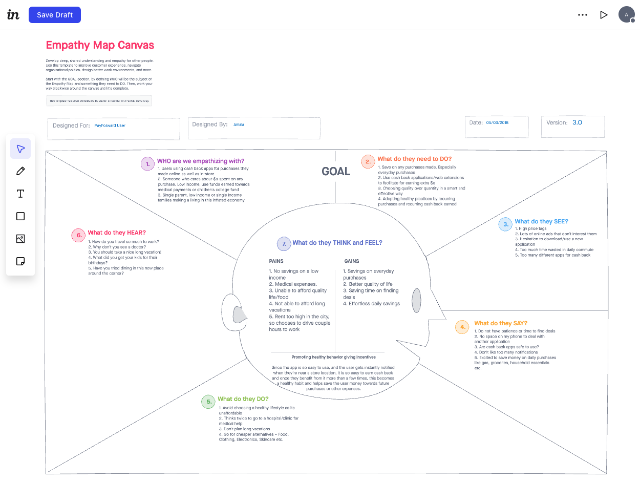
Empathy Map – Invision
Define – Brainstorming Features
To brainstorm features for the product roadmap, I created How Might We and Point of View Statements using insight from my research and Susan’s empathy map.
Entire Process Flow

User Journey – B2B Wellness Rewards

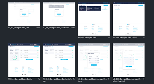
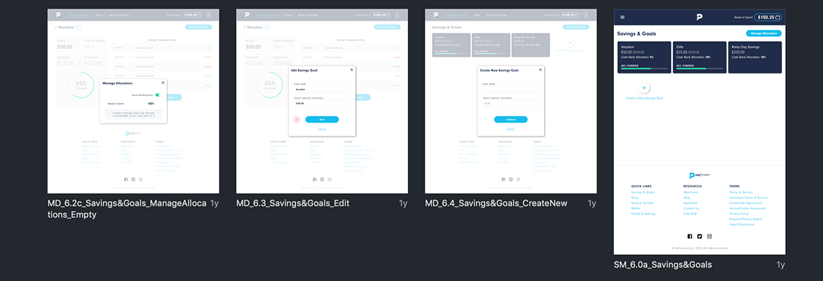
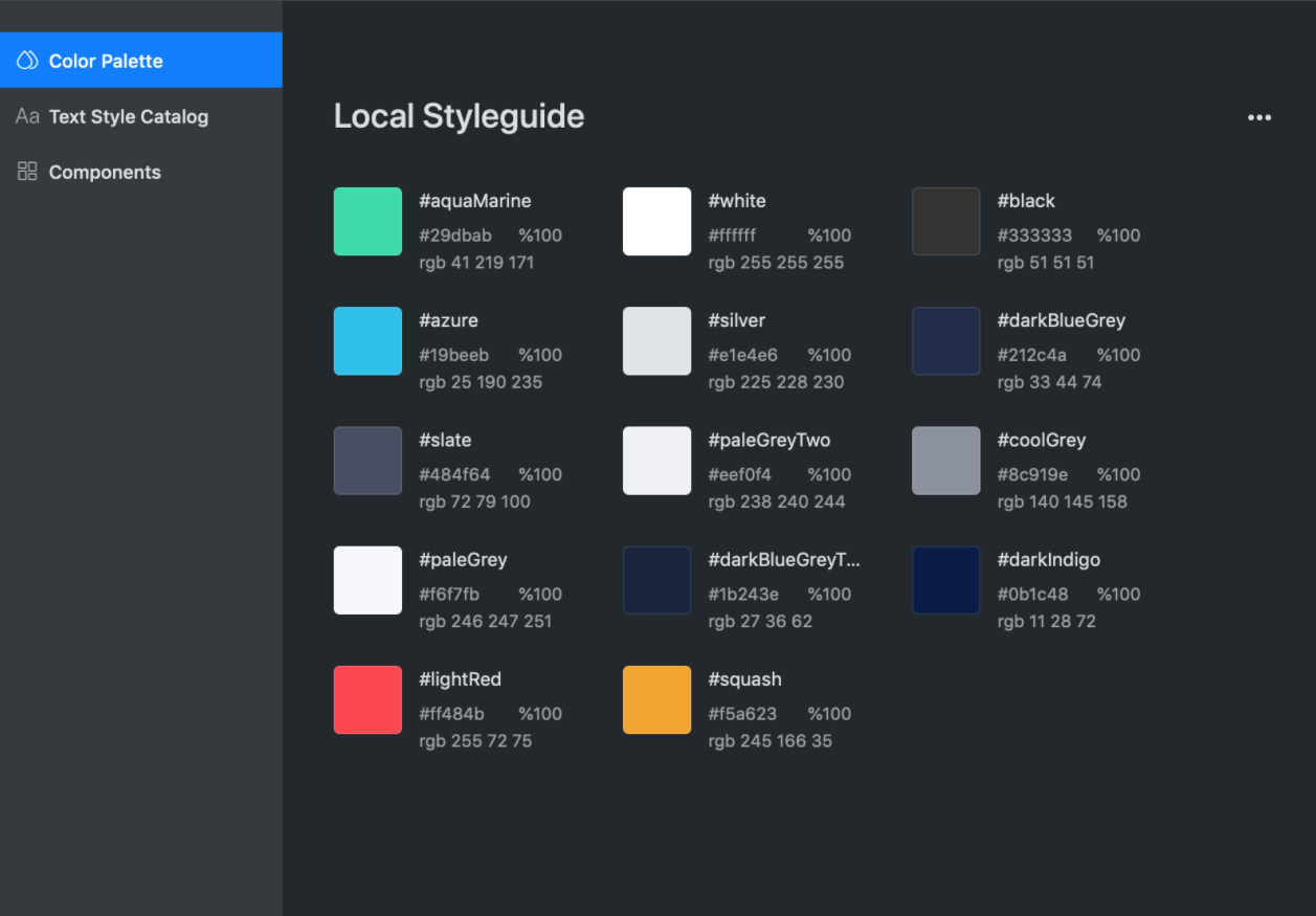
Design System
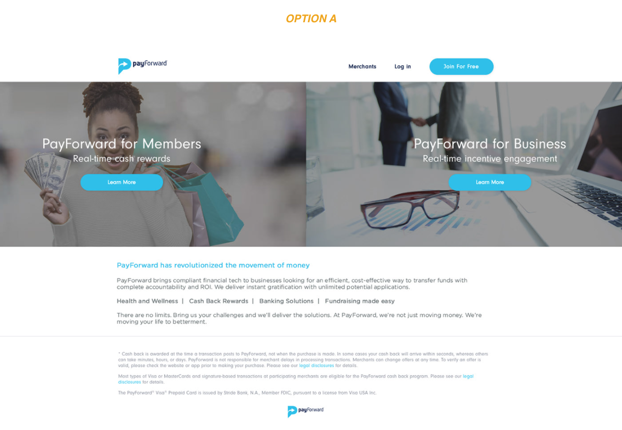
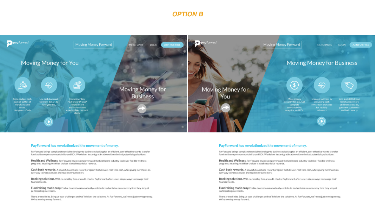
User Testing – A/B Test
Ran A/B tests for option A and B both shown below and the response was a 60/40.
Making option A more minimalistic and simple was one approach while option B was designed with more elements and intricate hover animations (created to generate more interest). Users gravitated towards the more minimalistic design (option A).
Other Challenges and UX Opportunities along the Design Journey
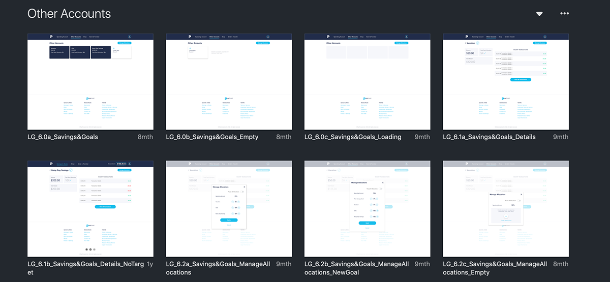
1. Displaying rewards earned and making sure our users do not forget about the rewards earned.
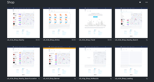
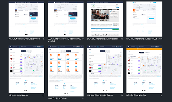
2. Making sure users are not overwhelmed by number of merchant pointers displayed on the map, for our in-store experience.
3. Streamlining the flow by adding a modal during onboarding for preferred merchants and in a separate favorites section for existing users who want to add or edit stores they shop at regularly. This helped us in creating a customized notification experience per user.
Mocks – Website, iOS & Android